

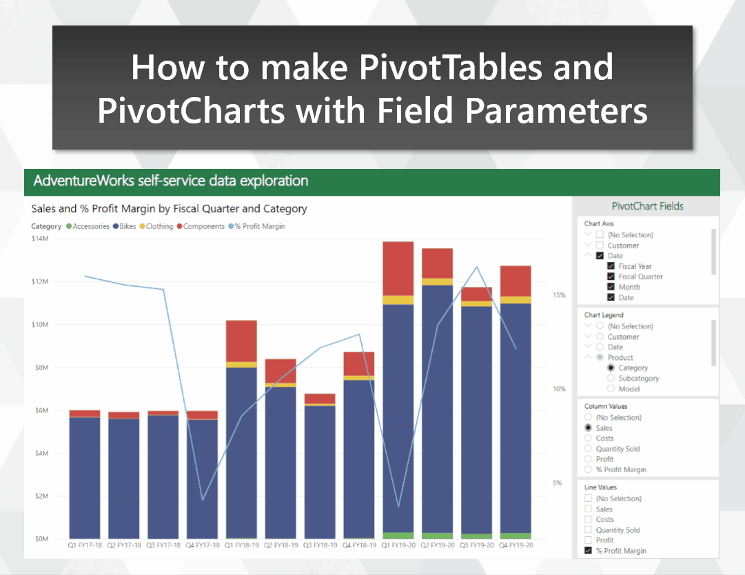
Make the transition from Excel to Power BI smoother by emulating PivotTables and PivotCharts
Migrating users from Excel to Power BI can be a challenge. Even users who know their way around a PivotTable may resist the move, despite the similar drag-and-drop experience in Power BI. In this post, I show how you can use Field Parameters to build a visually-similar experience to Excel PivotTables and PivotCharts. This can provide a familiar-looking stepping stone for users who have yet to make the jump over to Power BI for self-service.
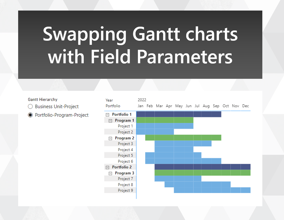
Swapping Gantt chart hierarchies with Field Parameters
With the new Field Parameters feature, you can now change the presentation of your visuals in a number of new ways. One way is to change the order of fields shown in a table or matrix, although the standard application of field parameters for this use case doesn't allow you to enforce a sort order. Here's an approach that allows you to retain your sort order, with an application for creating a Gantt chart of different hierarchies with overlapping members.

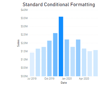
How to include a legend with a conditionally formatted chart
Conditional formatting is a fairly routine feature to add to a column chart. But Power BI doesn’t allow you to display a legend for each of your conditionally formatted columns by default. In this post, I show you a technique for including a legend to explain what each colour of your conditional formatting corresponds to.

How to reset calculation groups in a custom tooltip or drillthrough page
Using calculation groups in visuals can make your life a lot easier. But when you try to use custom tooltips or drillthroughs on these visuals, the calculation groups get applied to those as well. This can be challenging when you want your tooltip to show calculation items besides the one you’re hovering over. In this post, I’ll show you how you can address this issue, so you can reset and reapply your calculation groups for tooltips and drillthrough pages.

Displaying ordinal numbers in your Power BI Smart Narratives
In using the Smart Narratives feature for Power BI, I’ve found a few tricks to make your narratives even easier to read. For example, say you used Smart Narratives to show the sales performance for a given state. If that state came up 3rd best, how could you get your narrative to describe it as having the “3rd” highest selling sales, including the ‘rd’ after the 3? With a bit of DAX, you can get the right suffix showing for these ranked values, and make your Smart Narratives even smarter!
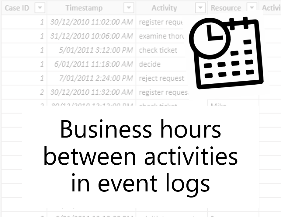
Calculating business hours between activities using DAX
Whenever you're working with event data, you often have data on activities performed, and the time at which they were performed. This data is useful for process mining, where you can track durations of cases that follow a process, identify bottlenecks in the process and identify instances where the intended process is not followed. In this article, I'll walk you through how you can track the time between events, so you can note how long something spends in a given state.

How to improvise What If Parameters in Power BI Live Connection models
In my last blog post, I explained a flexible technique you can use to build histograms in Power BI using measures and What If parameters. But one issue with that approach is that it assumes you have the ability to add a new table to your model. Fortunately, for many users this is no longer an issue, thanks to the recent release of DirectQuery over Azure Analysis Services models as a preview feature for Power BI Desktop. However if your reporting data is stored on premises, whether in SQL Server Analysis Services or Power BI Report Server, it may be a while until you can make use of this feature. In this post, I'll take you through a technique that I've used to build a histogram visual even when you don't have the ability to alter the data model used by your report.
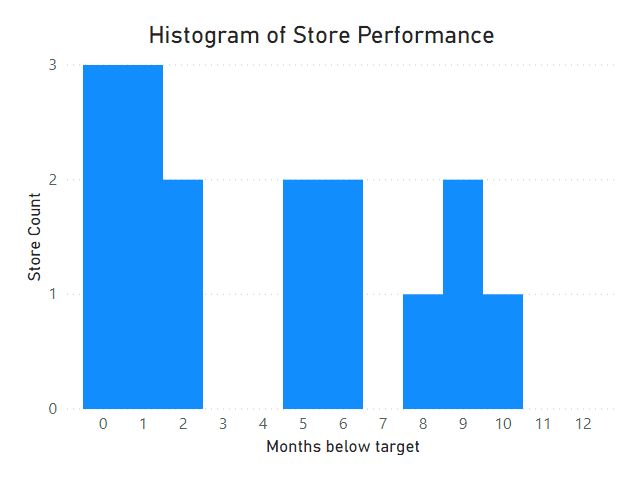
How to make Histograms in Power BI to answer business questions
Histograms are commonly used in statistics, but they can also be useful for answering business questions. However it’s not immediately obvious how to set them up in Power BI, so we’re going to go through a few techniques for how to build them to address a business scenario. Our end result will have the flexibility to slice on different values, and will give us a custom tooltip with additional insights.
Top 3 ways to direct attention with conditional formatting for column charts in Power BI
Conditional Formatting can be a powerful tool for giving your audience context, as long as it is used appropriately. In this post, we’re going to discuss 3 ways that you can use colour and conditional formatting in column charts to direct your audience’s towards the data points that matter.
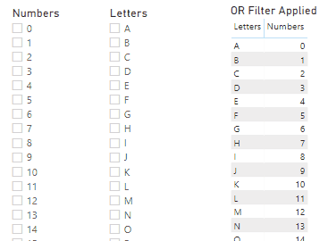
Slicing based on OR and XOR conditions in Power BI
Slicers on a report page in Power BI are an effective way to slice and dice your data under different conditions. But one situation that can be challenging to implement effectively is being able to apply multiple slicers, and show the rows that satisfy one condition or the other, not just the rows that satisfy both. In this blog post, I'll show you a simple implementation to allow you to address this scenario.