

Top 3 ways to direct attention with conditional formatting for column charts in Power BI
One thing that I find many people don’t pay enough attention to is the idea that numbers on a chart don’t mean anything unless they’re presented in context. If you show a measure that has doubled since last month, that may be very good news if the measure reports company profits, but very bad new if it represents workplace injuries. And besides that, if workplace injuries doubled from 2 to 4 this month for a small business with 10 staff, that’s much more concerning than it would be for a large company with 10,000 staff. So if you don’t provide context for the audience of your data visualisations, how do they know whether what they’re seeing is a good thing or a bad thing? In this post, we’re going to discuss 3 ways that you can use colour and conditional formatting in column charts to direct your audience’s towards the data points that matter.
Standard Conditional Formatting for Column Charts
As with other visuals, you can use conditional formatting in your column charts to encode colour based on column height. This technique will draw attention towards the higher values in your chart. You can easily enable this feature from the Data Colors section of the Format pane. Let’s see how we can apply conditional formatting to a chart of sales performance.
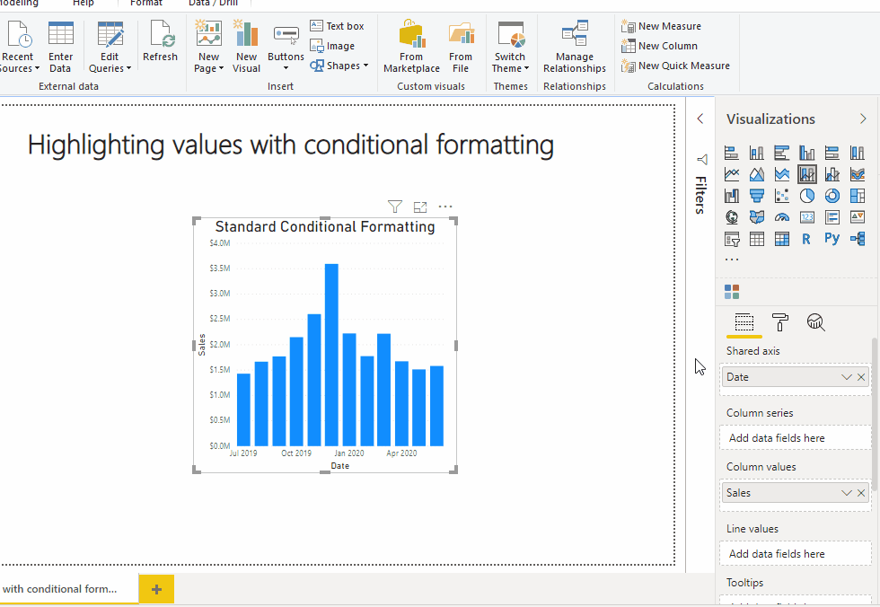
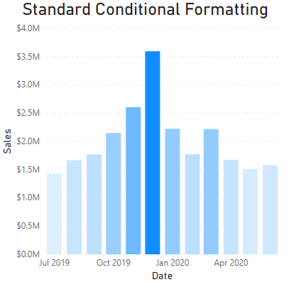
For this chart, we’ve format based on a colour scale using the sum of our sales as below.
While the chart does look visually appealing at first, there are a number of reasons that I try to avoid using this feature…
Discrete colour steps are easier to tell apart than the continuous colour gradient we’ve used. Cognitive psychology tells us that people struggle to accurately tell the difference between more than about 7 different colours at once.
It’s easy to notice a difference in height between two columns, but harder to tell two different colour hues apart. You can see this for yourself if you look at the last 3 columns of the chart - the heights clearly tell them apart, but could you work out which of them has the highest value based on colour alone?
Relying on the colour gradient alone can also be deceptive. Looking at the column for March, it has almost the same height as the column for January. However, March looks darker despite being the (slightly) lower value because it has light colours on either side to contrast against. Meanwhile our brains compare January to the darkest column in December, and trick us into thinking January is lighter than it actually is.
Given these issues, there are a few alternate techniques you can use that I find more effective for directing your audiences attention towards high values.
Highlighting the Top N values
With a bit of DAX, we can define a measure to help us conditionally format our chart to emphasize the highest values. To build such a measure, we must first consider how our sales performance data is structured. In this example, we have a table called Fact Sales Snapshot, which shows how each retail store for a company based in Melbourne have performed in each month of the 2019-2020 financial year.
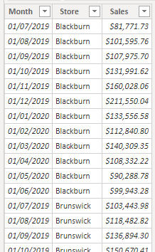
We’ve also got a date dimension in our model, related to our sales data on the Month field.
To give us some flexibility here, we’re going to define a What If parameter so we can vary how many values to highlight. Let’s call this parameter Top N, allowing it to vary between 1 and 12. I’ve also renamed the created measure from it’s default name of Top N Value to simply call it N.
Now we’ll create a measure which will identify whether a given column is within our top N sales months. To create this measure, we need to do three things…
Create a virtual table containing the data presented in our chart
Filter that table to the top N sales months
Check if the month currently selected in our column chart is within those top N sales months
Our measure that does all of this is defined below.
VAR StorePerformance =
SUMMARIZE (
ALL ( 'Fact Sales Snapshot' ), // Group our snapshot table...
'Dim Date'[Date], // By date (or rather by month since we only have months in our fact table)...
"Sales", CALCULATE ( SUM ( 'Fact Sales Snapshot'[Sales] ) ) // And return total months sales
)
VAR TopValues =
TOPN ( [N], StorePerformance, [Sales], DESC ) // Filter to months with top N sales
VAR TopMonths =
SELECTCOLUMNS ( TopValues, "Month", 'Dim Date'[Date] ) // Make a list of the top N months
VAR CurrentMonth =
SELECTEDVALUE ( 'Dim Date'[Date] ) // Currently selected column in chart
RETURN
IF ( CurrentMonth IN TopMonths, 1, 0 ) // Flag if current column is one of our top N months
Finally, we can use this measure to define conditional formatting for our column chart. This time around, we’ll format based on rules defined by the values of our new measure…
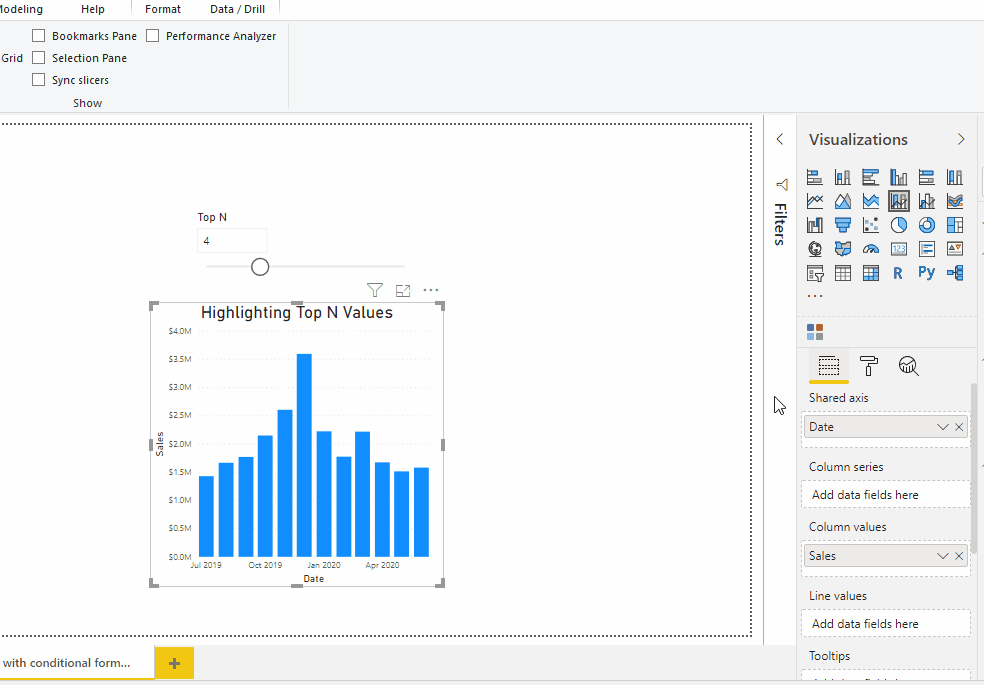
And now we will have our top N months highlighted in our chart! We can even vary our What If parameter and see the highlighting update in real time…
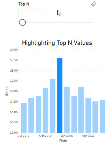
In some situations, this approach is more effective than standard conditional formatting, since the bolder colours draw attention more definitively than a colour gradient. While it can be very effective when the ranking of columns is important, it isn’t always ideal when values are very similar. For example, if you were highlighting the top 4 sales months above, you wouldn’t pay much attention to the October column as the month with the 5th most sales, even though it has almost the same sales as March, having the 4th highest sales.
Highlighting values above a threshold
An alternate way to highlight vales that doesn’t have this shortcoming is to highlight values above a particular threshold. This is most effective when you have targets that you need to quickly know when you’re operating above or below them.
To demonstrate this approach, we’re going to define another What If parameter, this time called Target. We’ll give it a range between $0 and $4 million, in steps of $10,000. Now we could bring the measure for this parameter into our chart as a line, but let’s see what happens when we do…
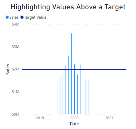
Since our What If measure returns a value even for months when there are no sales, it has thrown off our chart axis. To correct this, we can redefine the measure to only return the target value for months with sales.
IF (
SUM ( 'Fact Sales Snapshot'[Sales] ) <> BLANK (), // If date has sales marked against it
SELECTEDVALUE ( 'Target Value'[Target] ), // Return the parameter selection
BLANK () // Else return blank
)
And now we get an updated chart…
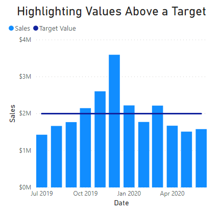
With our updated chart, we can define a measure to flag the columns above our threshold, and set the conditional formatting as we did earlier.
IF ( SUM ( 'Fact Sales Snapshot'[Sales] ) > [Target Value], 1, 0 )
And now our chart will update the highlighted values, depending on where the threshold is set.
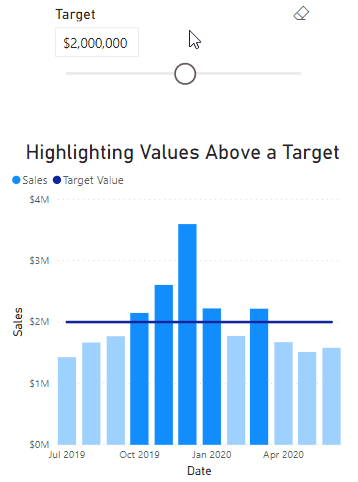
If you prefer, you can remove the target line from the visual and the conditional formatting logic will still work all the same.
Summary
Depending on the context that your data exists in, there are multiple approaches you can use to highlight the data that matters. Besides the standard conditional formatting options for charts, you can emphasise the highest ranking values, or highlight any columns above a particular threshold. When you pick the right approach for highlighting values for your situation, then that can make it a lot easier for your audience to work out whether or not they need to take action based on your visual.
Try it out for yourself!
Download the Power BI report file I used in this post to play around and build your own understanding hands-on.