How to make Histograms in Power BI to answer business questions
A histogram is a common tool in statistics to describe the distribution of values across a dataset. They can show you the most common values, the outliers, and the spread of your values, all at a single glance. Histograms can be useful not just within statistics, but also for answering business questions. However it’s not immediately obvious how to set them up in Power BI, so we’re going to go through a few techniques for how to build them to address a business scenario. We’ll start with a simple implementation, then build out a more sophisticated one with additional flexibility and insight into our scenario.
What is a histogram again? Isn't that just a column chart?
Histograms, quite simply, are a type of column chart. For many people, they may seem like one in the same, but while all histograms are column charts, not all column charts are histograms (similar to how all humans are mammals, but not all mammals are human). While you may be used to column charts that display financial measure like profits, histograms are column charts that give you information on the frequency of values, often times using a COUNT measure in Power BI. Histograms have a number of particular features that not all column charts have...
The x-axis contains continuous values (i.e. numbers) rather than categorical values (i.e. names of groupings), and the y-axis contains frequency / count data.
The values on the x-axis can be individual values (ages 0, 1, 2, 3, etc.) or binned values (ages 0-9, 10-19, 20-29, etc.). An item represented in a column of a histogram could have any value within that bin. We’ll only focus on histograms using individual integer values, since there are a number of articles already written by others on using binning for segmentation.
Histograms include bins that have a count of zero. The context of the situation may make it reasonable to omit empty bins at the top or bottom end of the distribution if they are not between two nonempty bins, e.g. you don't need to include ages 0-9 when describing staff at a company.
Using a histogram to answer business questions
Histograms aren’t just useful in statistics — they can also be used effectively in business scenarios to provide useful insights. In this example, we will be answering questions about a hypothetical retail company based in Melbourne, Australia. We have been given data about how each of the company's 16 stores have performed in each month of the 2019-2020 financial year. This dataset contain the Sales and Sales Targets, with an underlying table that looks like this…
Since the table contains a snapshot of the sales up to the end of each month, let's call this table Fact Sales Snapshot. Note here that the Month column is a date type field, but I've changed the formatting to make it more readable.
Based on the data in Fact Sales Snapshot, we've been asked to answer this question:
For how many months did each store sell below their sales targets?
If we want to answer this question, we're faced with a problem. Usually in Power BI, we build visuals by dragging and dropping fields onto the report page to form our axis and values. But if we want number of months to appear on our column chart axis, what field in our dataset would we use to make this axis? It's not immediately clear, since there is no field in our dataset with just integer values for our month counts. To deal with this problem, we're going to build out a table with these month values ourselves. And using this new table, we're going to build a histogram that shows the count of stores against the number of months that they were performing below their target.
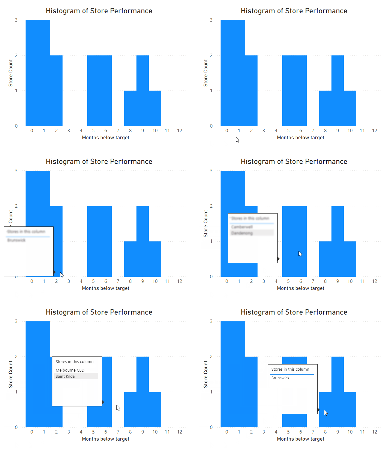
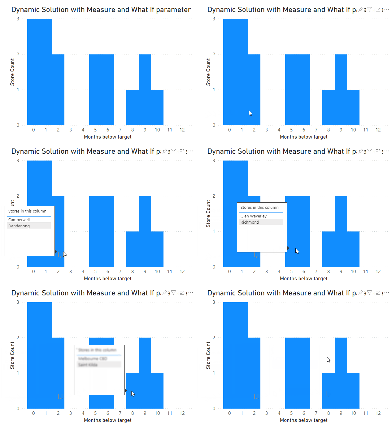
We'll be tackling this problem in two different ways. The first approach will be a so-called static solution, which relies on a calculated table which aggregates our existing snapshot table. The second will be a dynamic solution using a What-If parameter and a custom measure instead. And finally we'll extend our dynamic solution with a custom tooltip to tell us which stores are represented in each column of our histogram. As a taster for what’s to come, here’s what our final solution will look like…
Static solution using calculated tables
To being answering this question, we need to calculate the Sales to Target for each store's monthly sales. To do this, we can define a simple DAX measure as follows, and define it as a percentage.
DIVIDE (
SUM ( 'Fact Sales Snapshot'[Sales] ),
SUM ( 'Fact Sales Snapshot'[Target] )
) + 0
// The '+ 0' ensures that empty values return a 0. This is more succinct than a COALESCE function
Now using this new measure, we're going to build a new calculated table in DAX, which returns a unique list of stores, and for each store it counts how many months the Sales to Target measure is less than 100%.
SUMMARIZE (
'Fact Sales Snapshot',
// Group our snapshot table...
'Fact Sales Snapshot'[Store],
// By store...
"Months below target",
// And return the number of months below target...
CALCULATE (
COUNT ( 'Fact Sales Snapshot'[Month] ),
// By counting the number of months remaining...
FILTER (
VALUES ( 'Fact Sales Snapshot'[Month] ),
// After filtering our months down...
[Sales to Target] < 1
// To only include months under target
)
) + 0
)
The output of our new Store Performance table looks like this...
And we can drag these two fields into a column chart visual to get something like the following…
And here we have our histogram! It certainly answers our business question of how many months each store sold below target. But it has a few shortcomings that means it may not be the best approach for us to apply to other similar situations…
We've added a new table which will take up more space in our model and increase the file size, especially if we had a lot more stores or were doing this analysis for something like products which would likely have many different unique values.
We can't slice this table based on other attributes like month or store region.
For us, we could be content with not showing months 11 and 12, but we may want to give our report audience confidence that there are no stores that performed under target for more than 10 months.
Given all those shortcomings, we're going to tackle this problem again, but this time using a more scalable approach. Our new approach will not only address these issues, but will also allow us to include other features in later sections which will be significant value-adds for describing our business situation.
Dynamic solution using What If parameters and measures
This new solution will rely on building a dynamic measure that we will still be able to slice our data model on. This is a more robust approach that our first attempt, since our aggregated values are calculated as required based on filter context rather than being stored as fixed values in the model. However, this new solution still need to address the problem we identified earlier around needing a field for our histogram axis.
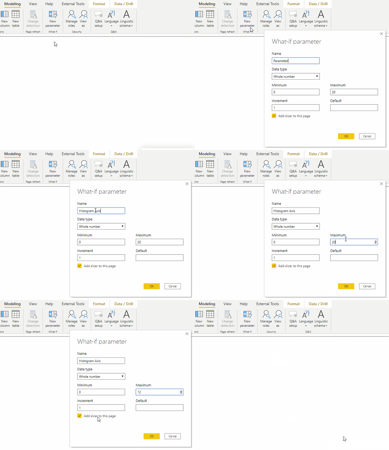
This time around we're going to to make another calculated table, albeit a much simpler one. We’ll define a What If parameter called Histogram Axis, and allow it to take values between 0 and 12.
Note that we’ve deselected ‘Add slicer to this page’, since we won’t be slicing on this value. We also won’t need the Histogram Axis Value measure that is automatically generated, as we’ll be creating a new custom measure instead. We’re simply using the parameter to define a calculated table with the values that should appear on the x-axis of our histograms, which we could have equally well defined manually as a DAX table.
Now that we have our histogram axis, we can define the measure that we’ll use to generate the values for our histogram. In this measure, we will generate our Store Performance table as a virtual table variable, so that it gets evaluated within the measure rather than being stored in the model. We then filter the table down to stores with sales performance corresponding to the currently selected Histogram Axis value. Finally, the measure returns the row count for this filtered table.
VAR HistogramColumn =
SELECTEDVALUE ( 'Histogram Axis'[Histogram Axis] ) // Store the currently selected histogram axis value
VAR StorePerformance =
// Virtual table defined the same as our calculated table
SUMMARIZE (
'Fact Sales Snapshot',
'Fact Sales Snapshot'[Store],
"Months below target",
CALCULATE (
COUNT ( 'Fact Sales Snapshot'[Month] ),
FILTER ( VALUES ( 'Fact Sales Snapshot'[Month] ), [Sales to Target] < 1 )
) + 0
)
RETURN
COUNTROWS (
// Count the rows...
FILTER (
// After filtering down...
StorePerformance,
// The StorePerformance virtual table...
[Months below target] = HistogramColumn
// To just stores that belong in the current histogram column
)
) + 0
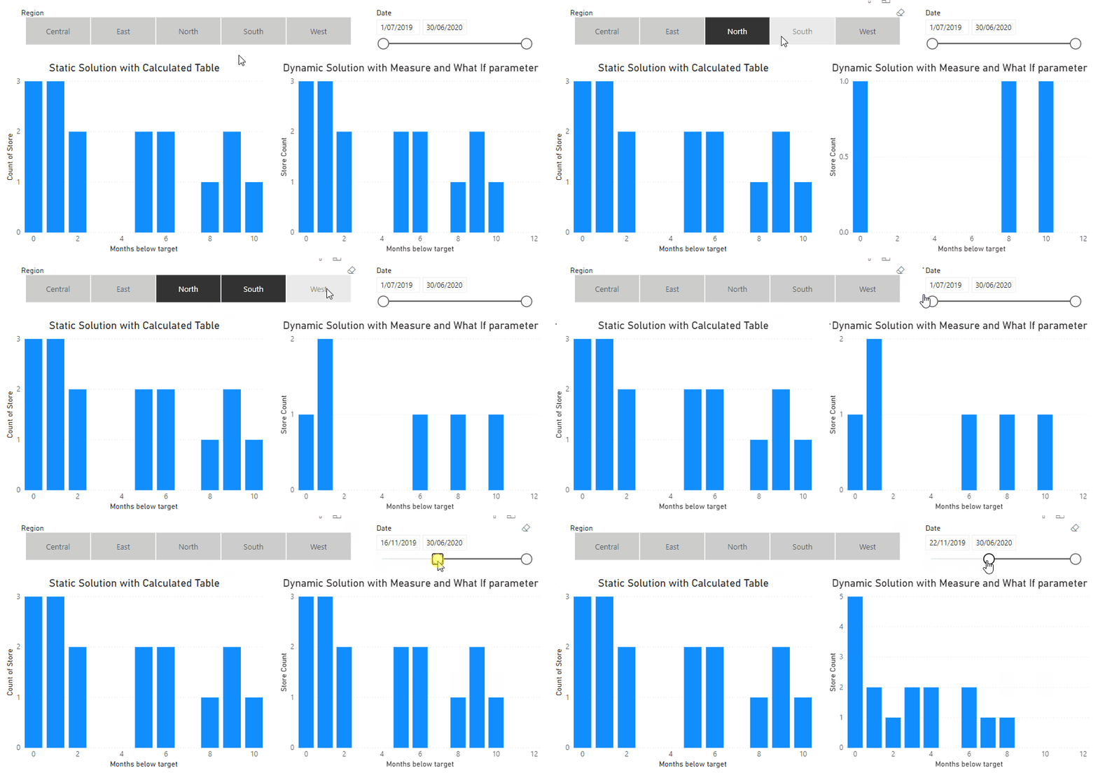
We can now use this measure to generate the same histogram as before, but since it is dynamically calculated from the values in Fact Sales Snapshot, we can now we can use slicers on the histogram. E.g. we may want to limit our analysis to stores in a particular region, or just to certain months of the year.
Note that when we use the slicers, our original static solution is not affected.
Formatting our histogram
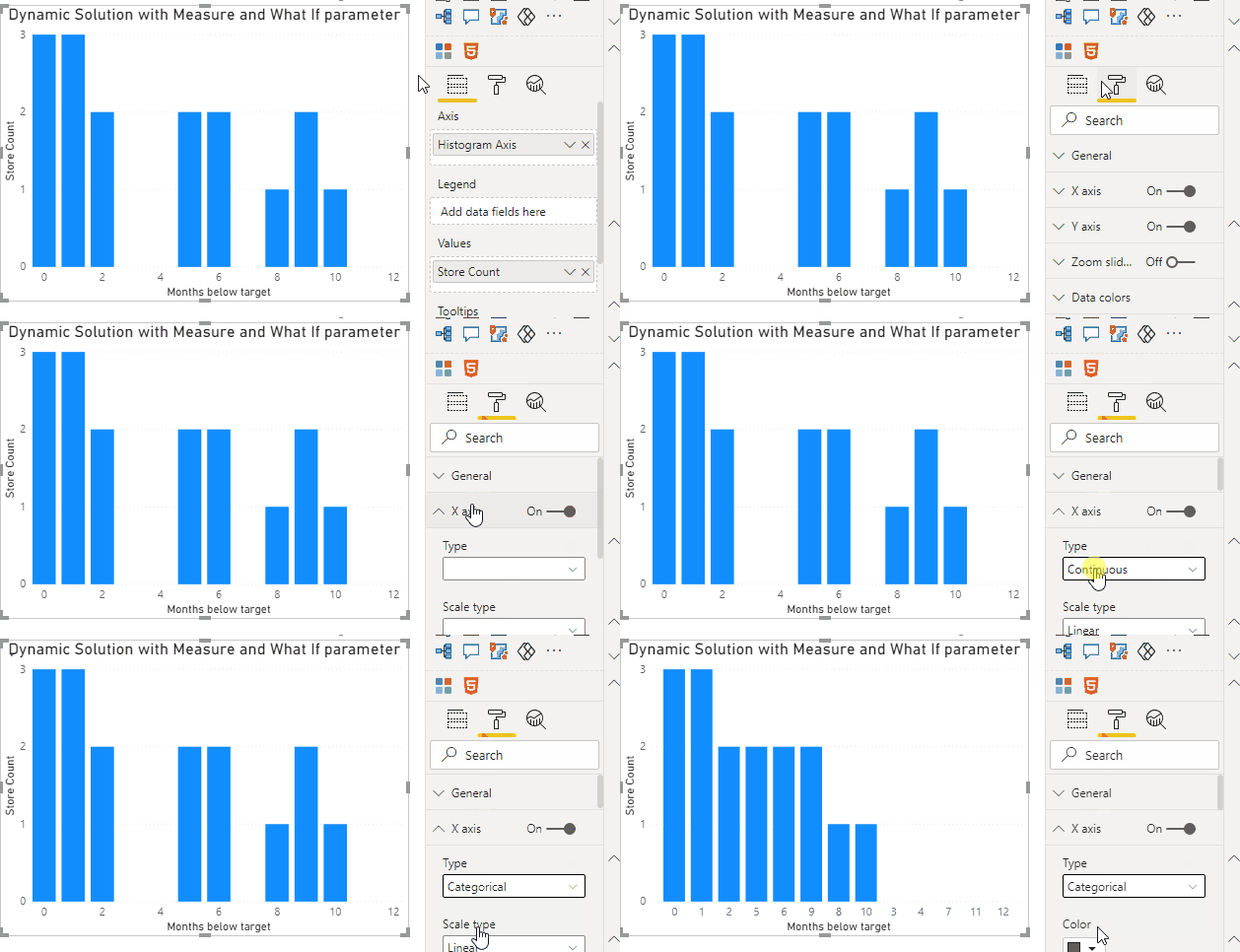
Next we’ll format our histogram in a conventional manner where there are no gaps between the columns — this acts as a visual cue to enforce the idea that the columns represent continuous values.
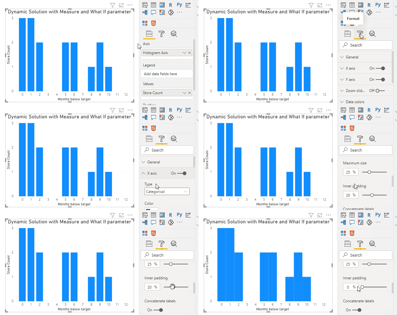
To do this, we (ironically) have to change our x-axis from continuous type to categorical. While our data represent a continuous series of numbers, for some unknown reason column chart visuals only allow you to adjust the width between columns when the data on the x-axis are marked as categorical. We can change this setting in the Format pane.
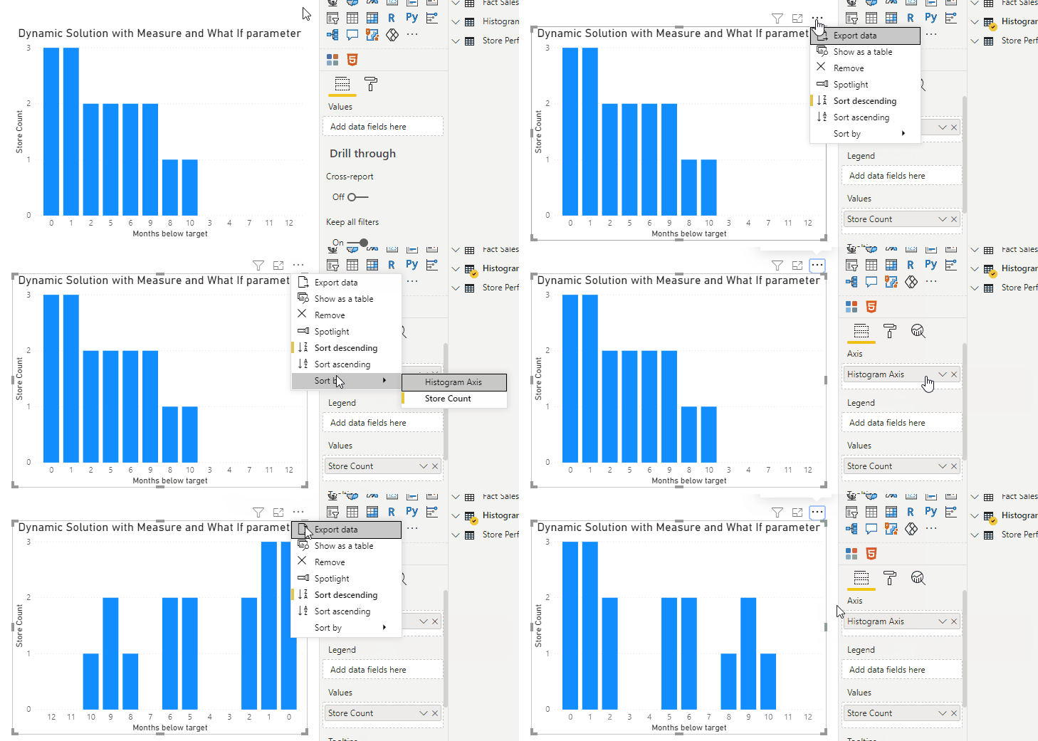
But unfortunately, when we make this change, our column ordering changes! The axis now gets sorted descending based on the measure value, but this is easy for us to correct.
Finally, we can adjust the width between the columns using the Inner padding option in the Format pane.
Adding a tooltip to list stores represented in each column
Now that we have the distribution of monthly store performance, the next thing we'd probably want to know is which stores are the ones performing well and which aren't. An effective way to show this information would be with a tooltip that tells us which stores are represented in each column of our histogram.
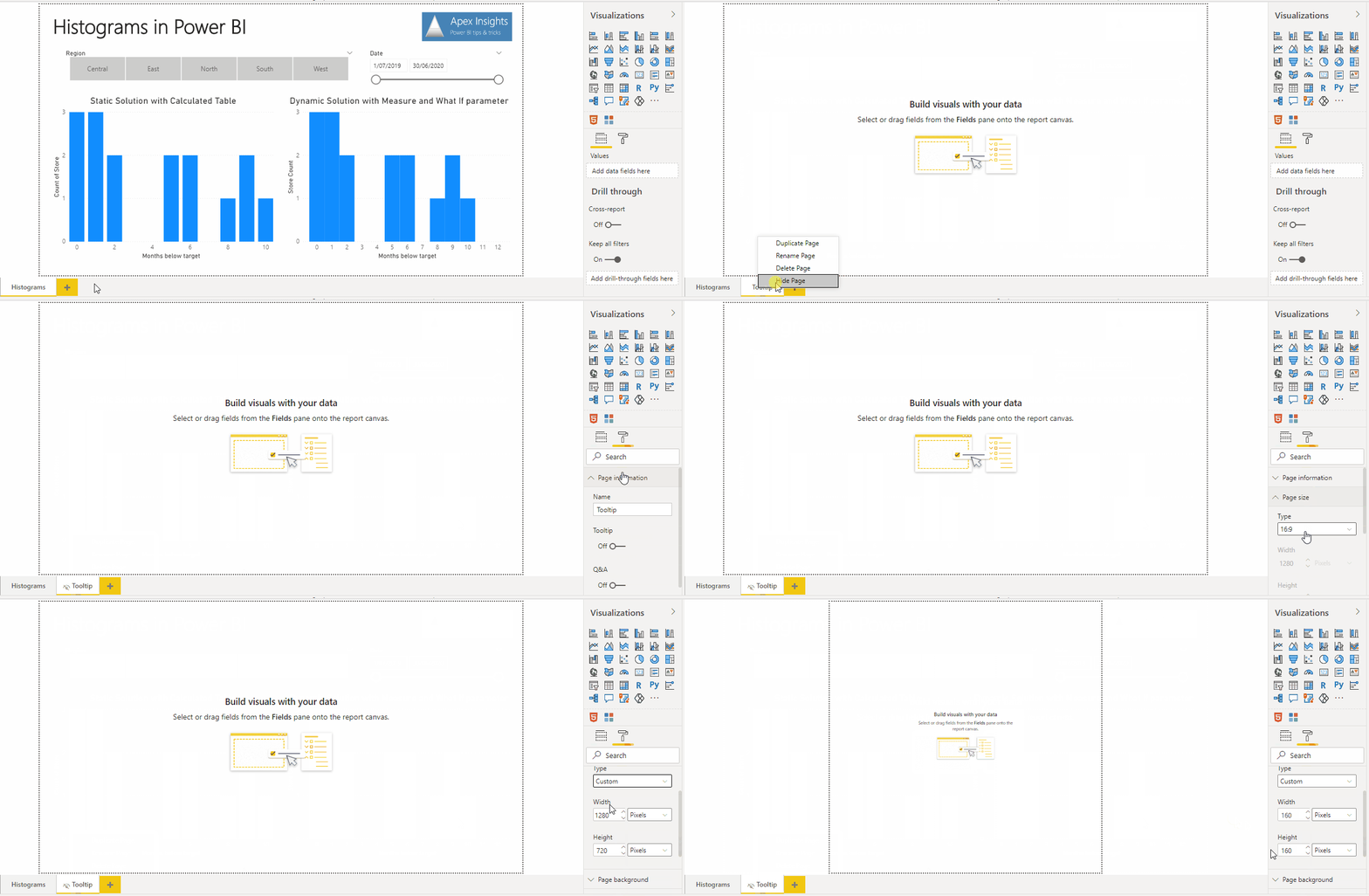
We can do this by creating a custom tooltip. To do this we can create a new page in our report, then define the page as a Tooltip page in the Format pane and reduce the page size to something small enough to use as a tooltip.
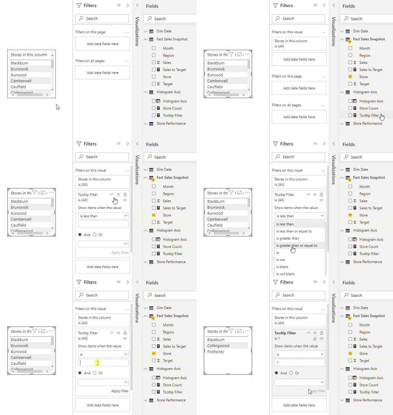
On our tooltip page, we can build a simple table visual using the Store field in Fact Sales Snapshot. By default, this will show all of our stores, but we only want it to display the stores for the currently selected histogram column. To accomplish this, we'll create another measure, which will be used as a visual-level filter on our visual. For each row in our table of stores, it will determine how many months the store underperformed. It will then compare that to the histogram column that is currently selected in creating the tooltip, and will only include the store if the store's performance matches the histogram column value.
VAR HistogramColumn =
SELECTEDVALUE ( 'Histogram Axis'[Histogram Axis] )
VAR MonthsBelowTarget =
// Defined as before
CALCULATE (
COUNT ( 'Fact Sales Snapshot'[Month] ),
FILTER ( VALUES ( 'Fact Sales Snapshot'[Month] ), [Sales to Target] < 1 )
)
RETURN
IF ( MonthsBelowTarget = HistogramColumn, 1, 0 )
To enable this filter logic, we just have to drag the measure into the visual level filters for our tooltip table, and only include values for which the measure returns 1.
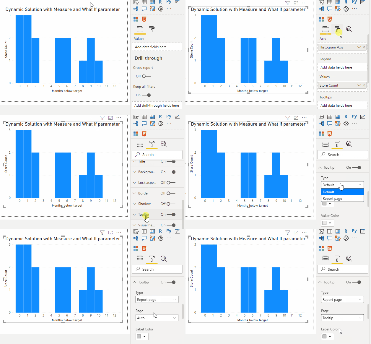
After setting all this up, we can navigate back to our main report page, and format the histogram visual to refer to our tooltip page as a report page tooltip.
And with that, we can now see our dynamic histogram with tooltip in action!
Other scenarios to use histograms in
These techniques of building histograms for analysis can be very powerful when used effectively. With these insights, a report user may be able to identify the stores with poor sales performance and used that to investigate (and hopefully resolve) the key factors driving their underperformance. You could even extend this scenario to analysing sales of individual products and identify stores where that product has underperformed (rather than considering the sales performance across all products in store as we have done). Customers shopping at these stores may offer valuable insights to help your company to improve its product offering.
Summary
In this article, we built a histogram in Power BI which showed us the distribution of store performance, based on how many months each store’s sales were below target. We first made our histogram using an aggregate table in DAX, and then we extended our solution to use a measure and a What If parameter. We then formatted our histogram to remove the space between columns, and added a custom tooltip to show which stores were represented in each histogram column.
As a final note, bear in mind that the approaches we've discussed both rely on you having the ability to define a calculated table in your model. However, if you happen to be working off of a report connected to an Analysis Services model, you probably won't have the same kind of flexibility to create additional tables. In my next blog post, I'll take you through an implementation you can use to create histograms when you can't actually create a new table in your model, so stay tuned!
Try it out for yourself!
Download the Power BI report file I used in this post to play around and build your own understanding hands-on.

