

How to improvise What If Parameters in Power BI Live Connection models
In my last blog post, I explained a flexible technique you can use to build histograms in Power BI using measures and What If parameters. But one issue with that approach is that it can’t be applies to data models with a Live Connection, as these don’t allow you to add a new table to your model. Fortunately, for many users this is no longer an issue, thanks to the release of DirectQuery over Azure Analysis Services models for Power BI Desktop. However if your reporting data is stored on premises, whether in SQL Server Analysis Services or Power BI Report Server, it may be a while until you can make use of this feature.
In this post, I'll take you through a technique that I've used to build a histogram visual even when you don't have the ability to alter the data model used by your report. The situation described is admittedly quite niche, so I would recommend that you treat this article as a learning resource to show you some creative ways to apply DAX to sidestep modelling constraints, rather than expecting to immediately find a practical application of the technique in your own reports.
Our challenge
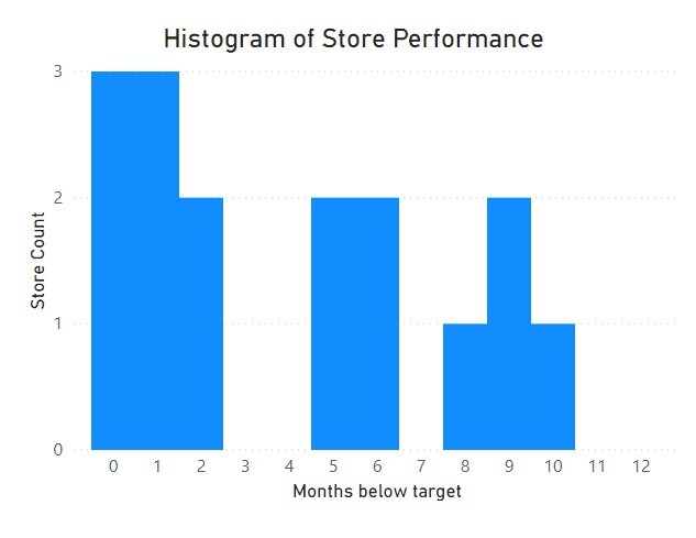
As a reminder, last time we created a histogram describing a retail chain’s sales performance. Our histogram showed the count of stores by how many months they sold under target. We built our final histogram using a What If parameter for the axis values, and a custom measure to count the number of stores underperforming for each of the possible months. Our final solution ended up looking like this…
If you’re working off of an Analysis Services Tabular model, this method proves to be ineffective due to the inability to add What If parameters. However, we don’t fundamentally need a What If parameter for this purpose, we just need a field that has the values 0 through 12. As long as there is such a field in our model, we can use that field as the axis of our histogram. Even though there may be relationships in place which would filter the calculated values, we can still write a measure for our histogram which can ignore this filtering.
Our situation
For this example, we’ll work off of a dataset made in Power BI rather than a Tabular model — this will give us better visibility on what’s going on under the hood. Despite this, the approach we’ll take works equally well on a Tabular model, when it comes time to implement it yourself.
Just as in the last post, we've got a data table with sales performance data by month and store. This time around, I've added a date dimension, which is related to our main data table on the month column (which is a date type field).
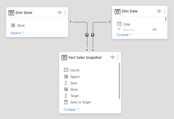
Here are some of the fields in Dim Date…

At first glance, it would seem as though a simple integer field like Day or Month may be suitable to use for the histogram axis. However, recall that our histogram varied between 0 and 12, so we’d be missing the 0 value by using either of those fields. Instead we can use the Relative Day field, which is used to denote how many days it is between the date in the current row and today (or more accurately, the last refresh date). Your own models may not have such a field, so you may have to do your own analysis of the fields in your model to find a suitable one.
Note that in the context of an Analysis Services connection, you won't have the ability to see the underlying tables to find a suitable field. In this case, you can explore the values in the tables by either dragging them onto the report page canvas to see the distinct values as a table, or you can use DAX Studio to connect to the model and query the full table. If you haven't used DAX Studio for this before, Matt Allington has a great blog post to teach you the basics.
Now that we have identified the field to use for our axis, we can define the corresponding measure for the histogram columns. We can start by defining the measure as we did in the last post, but this time with Relative Day as the selected field instead. For those who need a refresher, this measure creates a virtual table of the total number of months where sales were below target by store. It then counts how many stores underperformed for the selected number of months. Here’s how our measure is defined…
VAR HistogramColumn =
SELECTEDVALUE ( 'Dim Date'[Relative Day] ) // Store the currently selected histogram axis value
VAR StorePerformance =
SUMMARIZE (
'Fact Sales Snapshot', // Group our snapshot table...
'Fact Sales Snapshot'[Store], // By store...
"Months below target", // And return the number of months below target...
CALCULATE (
COUNT ( 'Fact Sales Snapshot'[Month] ), // By counting the number of months remaining...
FILTER (
VALUES ( 'Fact Sales Snapshot'[Month] ), // After filtering our months down...
[Sales to Target] < 1 // To only include months under target
)
) + 0
)
RETURN
COUNTROWS ( // Count the rows...
FILTER ( // After filtering down...
StorePerformance, // The StorePerformance virtual table...
[Months below target] = HistogramColumn // To just stores in the current histogram column
)
) + 0
Now we can drag Relative Day into the chart axis well, and Store Count into the values well, giving us the following…
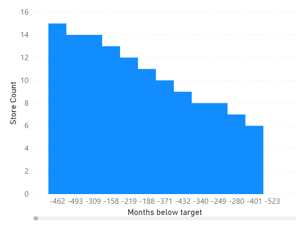
Okay, this is admittedly looking a bit odd. The first thing we’ll need to do to make this return something more sensible is to limit the Relative Day values on the axis just to our 0 through 12 values.

After limiting our axis values, we find that the measure returns 0 for all columns, rather than a distribution of values. What’s going on here?! Well, we’ll have to take a brief step into DAX theory land before we can tackle this problem.
A quick lesson in how DAX measures work
To get around this, we need to understand how measures get evaluated by the Vertipaq engine, which is the brains behind DAX. Before the engine does any arithmetic to count our rows, it follows a sequence of steps to filter the data model…
First, it will consider all of the filters being applied to the visual element. E.g. for a cell in a pivot table. it will consider the selected column and row, and any external filters applied.
Then, it will modify those filters according to any applied filter context modifiers, like CALCULATE or CALCULATETABLE.
Next, it will then apply those filters to the data model.
And finally, it will follow any active relationships to further filter the rows in the model.
Only at that point will it perform the arithmetic operations to give us our measure value.
If that sounded confusing, that's probably because it is! You don’t necessarily have to understand all that the first time you read it, as understanding how DAX expressions are evaluated can be somewhat challenging. But it is one of the challenges in learning Power BI with the biggest payoff, as it will make many of the problems you face in developing reports so much easier to solve. You can learn more about how DAX expressions get evaluated in Rob Collie and Avi Singh's incredibly digestible book Power Pivot and Power BI (look at Chapter 7 in particular).
Back to our scenario…
With that extra context, we can figure out what’s going on with our measure. The evaluation step that causes us problems is in following the active relationships. When we are looking at the histogram column equal to 1, recall that this is actually referring to the values where relative day equals 1. Since this is one day in the future, and all our sales performance data is historical, this filters the model down to exclude all our sales data. In other words, we’ve reduced our row count to zero before we even have a chance to evaluate the measure!
So how can we get around this problem? Well, we could delete the relationship, but then we wouldn’t be able to filter using other date fields. Instead, we can remove the filtering effect from Relative Day by using a DAX function that is (fittingly enough) called REMOVEFILTERS. We’ll need to use this wherever filtering would occur when the measure gets evaluated — this ensures that the filtering via the relationship will be ignored. In our case, the filtering occurs when the StorePerformance variable and the final measure output are evaluated. Here’s what our measure looks like when we add these extra clauses (marked by comments)…
VAR HistogramColumn =
SELECTEDVALUE ( 'Dim Date'[Relative Day] )
VAR StorePerformance =
SUMMARIZE (
CALCULATETABLE (
'Fact Sales Snapshot',
REMOVEFILTERS ( 'Dim Date'[Relative Day] ) // Ignore Relative Day filter
),
'Fact Sales Snapshot'[Store],
"Months below target",
CALCULATE (
COUNT ( 'Fact Sales Snapshot'[Month] ),
FILTER ( VALUES ( 'Fact Sales Snapshot'[Month] ), [Sales to Target] < 1 )
) + 0
)
RETURN
CALCULATE (
COUNTROWS (
FILTER ( StorePerformance, [Months below target] = HistogramColumn )
) + 0,
REMOVEFILTERS ( 'Dim Date'[Relative Day] ) // Ignore Relative Day filter
)
Now when we use this new measure in our histogram, we will get the same histogram as we made in the last post, but this time without relying on any custom tables.

Additional considerations
When building out a report page with this visual, it may be quite natural to want to add a date slicer to your page. This is still an option in this scenario, however you’ll have to use the date field from the fact table in the slicer, rather than the field in your date dimension. Introducing a filter context from the date table here will potentially filter the Relative Day values before the histogram columns can even be evaluated.
Also recall that the last time we built this histogram, we also built a tooltip to list the stores represented in each histogram. The histogram with the tooltip ended up looking like this…

If we want to get this tooltip working for our new histogram as well, we need to modify the measure that indicates whether or not to include a given store in the tooltip. We can use REMOVEFILTERS for this again…
VAR HistogramColumn =
SELECTEDVALUE ( 'Histogram Axis'[Histogram Axis] )
VAR UnderperformingMonths =
CALCULATETABLE (
FILTER ( VALUES ( 'Fact Sales Snapshot'[Month] ), [Sales to Target] < 1 ),
REMOVEFILTERS ( 'Dim Date'[Relative Day] ) // Ignore Relative Day Filter
)
VAR MonthsBelowTarget =
COUNTROWS ( UnderperformingMonths )
RETURN
IF ( MonthsBelowTarget = HistogramColumn, 1, 0 )
Summary
Even in scenarios where you aren't able to alter your data model, you can often still find ways to solve problems that would conventionally involve new tables, columns or relationships. In this case, we were able to use an established field in our model, and alter the evaluation context of our measures in a few places to adapt the field into a What If parameter.
I will caution that having to write complicated DAX expressions can often be a warning sign of the need to remodel your dataset. But even star schemas can’t address every scenario; they are built to cater to generalised situations. When you’re working off of a static model meant to service many reports or users, that general scenario may not cut it for you. As you get more familiar with DAX, you can pull off these kinds of tricks to sidestep the constraints of working with static data models.
Try it out for yourself!
Download the Power BI report file I used in this post to play around and build your own understanding hands-on.