How to improvise What If Parameters in Power BI Live Connection models
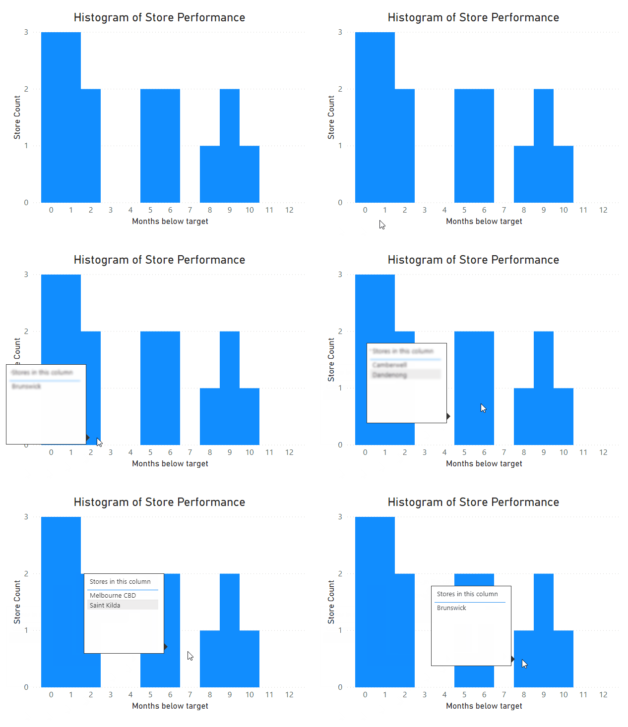
In my last blog post, I explained a flexible technique you can use to build histograms in Power BI using measures and What If parameters. But one issue with that approach is that it assumes you have the ability to add a new table to your model. Fortunately, for many users this is no longer an issue, thanks to the recent release of DirectQuery over Azure Analysis Services models as a preview feature for Power BI Desktop. However if your reporting data is stored on premises, whether in SQL Server Analysis Services or Power BI Report Server, it may be a while until you can make use of this feature. In this post, I'll take you through a technique that I've used to build a histogram visual even when you don't have the ability to alter the data model used by your report.

How to make Histograms in Power BI to answer business questions
Histograms are commonly used in statistics, but they can also be useful for answering business questions. However it’s not immediately obvious how to set them up in Power BI, so we’re going to go through a few techniques for how to build them to address a business scenario. Our end result will have the flexibility to slice on different values, and will give us a custom tooltip with additional insights.
