

How to include a legend with a conditionally formatted chart
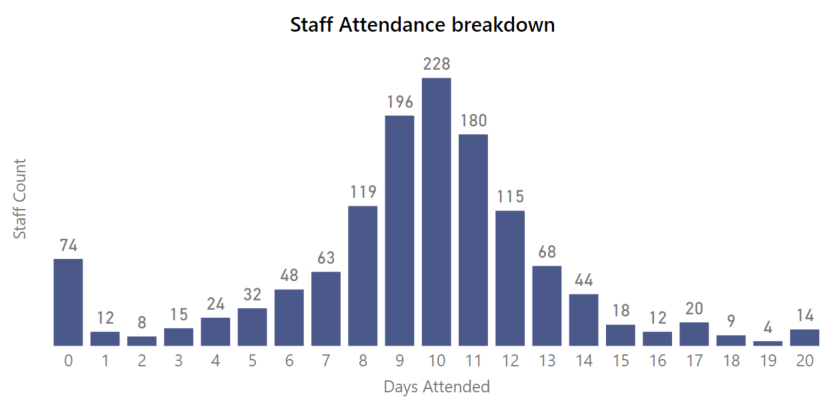
I recently had a requirement from a client to create a chart showing the distribution of how many days staff were coming into the office. They wanted this shown not just for every week, but for rolling 4 week periods. So, for a given week (say the week ending Sunday 28th Feb 2021), they wanted to see how many staff came in on all 20 of the working days in February, how many came in only 19 out of 20 days, all the way down to how many people didn’t come in at all. Here’s an example of what such a chart might look like…
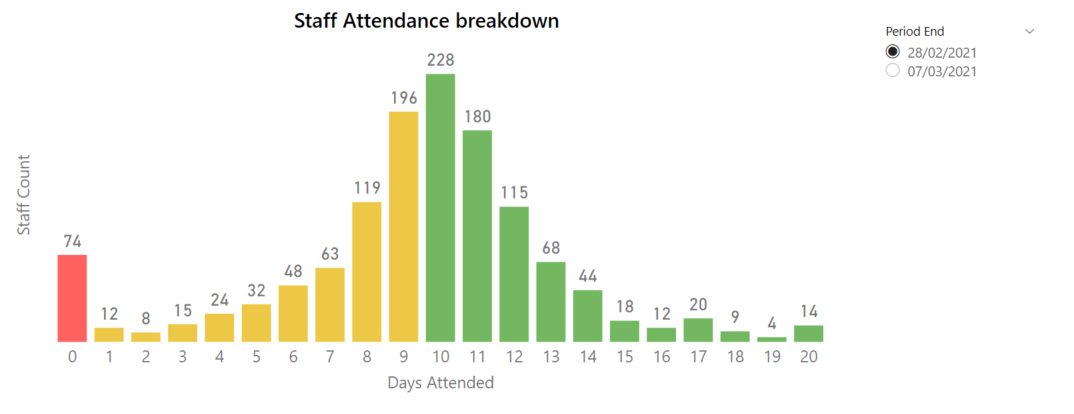
This was a good starting point, but they also wanted the chart to show who had met their attendance targets. Staff were expected to attend the office for at least 10 days out of every rolling 4 week window.
They also wanted the chart to call out the number of staff who didn’t attend the office at all during the selected period. We settled on the following rules for the chart:
Highlight the column for staff who attended 0 out of 20 business days as Red.
Highlight columns for 1 through 9 days of attendance as Yellow.
Highlight columns for 10 through 20 days of attendance as Green.
Conditional formatting columns
You can use conditional formatting to achieve this. To build this out, let’s look at our underlying data.
In this example, we’ve got an aggregated table called ‘Staff Attendance Snapshot’ that has one row for each of the possible number of days that staff can attend (0 through 20). It then lists how many staff attended for that many days 1 .
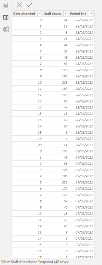
These snapshotted values are provided for multiple weeks. For now, we'll build a chart using only the values for the period ending on 28/02/2021.
To build out our chart, we can use the Days Attended field as the chart axis, and Staff Count field can be used for the chart values (as an implicit measure). It’s also sensible to look at this week by week, so we can add a slicer to our page to select the period of interest.
To apply conditional formatting, we can write a measure that works out which Days Attended value is selected for each column of the chart, and assigns that to a value.
VAR DaysValue =
SELECTEDVALUE ( 'Staff Attendance Snapshot'[Days Attended] )
RETURN
SWITCH (
TRUE (),
DaysValue = 0, 1,
DaysValue > 0
&& DaysValue < 10, 2,
DaysValue >= 10, 3,
4
)
With the chart selected, go to the Format pane and select the conditional format button under Data colours. We’ll format based on the field values returned for our measure…

This gives out our conditionally formatted chart...
What about when targets change?
While this addressed the initial requirement, the client followed up with some further requests.
An additional requirement from the client was that the conditionally formatted targets needed to change based on what week is selected. Attendance targets may change week to week based on lockdowns or relaxing of social distancing limits.
In addition to this, the client also wanted the chart to have a legend describing what each colour corresponds to.
To address both of these requirements, we’ll need to take a slightly different approach. This new approach requires us to add a few new tables to our model
Extending the data model
First, we’ll need to build a table called ‘Target Status’ which contains a list of the labels we want to appear in our legend.

The Target Status Code column will also be used as the Sort By column for Target Status.
Next, we need a table that lists the targets for each period.
We’ve already established that for the 4 week period ending 28/02/2021, staff were expected to attend for 10 of those 20 business days.
But let’s say that a lockdown started on 01/03/2021 that applied to all staff at the company. As such, the next rolling 4 week period for the week ending 07/03/2021 would have a reduced target, since staff aren’t permitted to attend for one of the four weeks. In this case, the target for this new period would be for staff to have attended 5 out of 20 days. In reality, these 5 days would have to have come from their attendances in the last 3 weeks of February.
Here’s what our ‘Weekly Targets’ table would look like…

Finally, we need a date dimension, which we’ll use as a common dimension between the ‘Staff Attendance Snapshot’ table and the ‘Weekly Targets’. Since this only gets used to show values in the period slicer, I’ve just made a simple table with only the dates that appear in the fact table. In more general cases, you’ll want to use a date dimension with a contiguous list of dates.

Once we’ve loaded these tables, we’ll need to model them as follows. The ‘Date’ table is relate to each table via the [Period End] columns, and ‘Target Status’ related to ‘Weekly Targets’ on the [Target Status Code] columns.

Building our new chart
Now that we’ve built out our data model, we can start building our visuals.
First, we need to create a single-select slicer based on ‘Date’[Period Out] to display the staff attendance for one rolling period at a time. If we don’t do this, we risk returning unmeaningful results by double-counting staff members across different periods.

As before, we can start building our chart with Days Attended as our Axis field, and Staff Count as an implicit measure for our Values. For this technique, it’s important to make sure we’re using a stacked column chart as our visual 2 .
We need to bring ‘Target Status’[Target Status] into the Legend well in the Format pane. This will allow us to include columns of different colours, while showing each item on the chart legend.
However, when we do this, we get an error.

This happens because there is no way for the filter context from the Target Status column to propagate to the ‘Staff Attendance Snapshot’ table through the relationships in the data model.
Instead, we can author a new DAX measure to apply the filters as intended.
VAR LowerLimit =
MIN ( 'Weekly Targets'[Min Limit] )
VAR UpperLimit =
MAX ( 'Weekly Targets'[Max Limit] )
VAR AxisValue =
SELECTEDVALUE ( 'Staff Attendance Snapshot'[Days Attended] )
VAR MeasureValue =
SUM ( 'Staff Attendance Snapshot'[Staff Count] )
RETURN
IF (
AxisValue >= LowerLimit
&& AxisValue <= UpperLimit,
MeasureValue,
BLANK ()
)
The measure follows this logic…
It determines what the upper and lower limits of the Target Status for the period we’ve selected in the slicer.
It then determines which chart column we are evaluating (i.e. which Days Attended values we’re evaluating)
It works out if the the Days Attended values applies to the Target Status that we’re considering. E.g. If we’re evaluating the Target Status “Staff with no attendance”, then this only applies when we’re evaluating the Days Attended = 0 chart column.
If the Days Attended value lies in the Target Status range, then it returns the number of staff who attended. Otherwise it returns blank.
When we drag this new measure onto the chart (and update the chart colours in the Format pane), here’s our result…
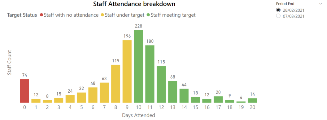
Now our colours will be presented as before, but with our legend showing. Note that I’ve already changed the sort order of the Target Status field, so that the colour order in the legend matches the order displaying left-to-right in the chart.
Finally, we can see that our target values (i.e. our chart colours) update as we change the rolling 4 week period selected in our Period End slicer.

Extension: Adding a summary table
To finish this off, we can also add a table that tells us the number and percent of staff that fall into each Target Status category.
Out table will contain the Target Status’[Target Status] column, as well as two additional measures.
VAR LowerLimit =
MIN ( 'Weekly Targets'[Min Limit] )
VAR UpperLimit =
MAX ( 'Weekly Targets'[Max Limit] )
RETURN
CALCULATE (
SUM ( 'Staff Attendance Snapshot'[Staff Count] ),
'Staff Attendance Snapshot'[Days Attended] >= LowerLimit,
'Staff Attendance Snapshot'[Days Attended] <= UpperLimit
)
DIVIDE (
[Staff with Target Status],
CALCULATE (
SUM ( 'Staff Attendance Snapshot'[Staff Count] ),
ALL ( 'Staff Attendance Snapshot'[Staff Count] )
)
)
Now we can see our overall summary of staff attendance in the table, and the full distribution in our colour-coded chart. Note that I’ve added some conditional formatting to the table so that it’s easier to compare each Target Status.

Try it out for yourself!
Download the Power BI report file I used in this post to play around and build your own understanding hands-on.
-
In a real-world scenario, you’ll likely have a transaction table that lists every time a staff member enters the office (based on swipe card access for example). In that scenario, you could use a disconnected table for the number of days attended, and use a custom measure to count up how many days each employee attends for. I’ve previously written about that approach here. ↩
-
If we use a clustered column chart for this technique instead, then the spacing between the resulting columns will look confusing for the report user. ↩