

Make the transition from Excel to Power BI smoother by emulating PivotTables and PivotCharts
I’ve been playing around with Field Parameters a lot since they were introduced as a Preview Feature in the Power BI Desktop May 2022 release. One interesting use case for them is to enable a guided experience for self-service data exploration.
Using Field Parameters, you can effectively set up an experience similar to PivotTables and PivotCharts in Excel. While Power BI has always had a drag-and-drop report interface that is comparable to Excel, many business users still prefer sticking with what they know in Excel. But by using Field Parameters, I’ll show you how you can set up a visually-similar experience to Excel PivotTables. Providing a familiar interface to your die-hard Excel users can help make the move to Power BI much more seamless for them.
Here’s what we’ll be setting up…

This report gives users the chance to visualise a dataset with any combination of line and column charts they’d like.
And for users who prefer a PivotTable, we can also build this…

You can play with the report for yourself here, or read on to learn how to build these for yourself.
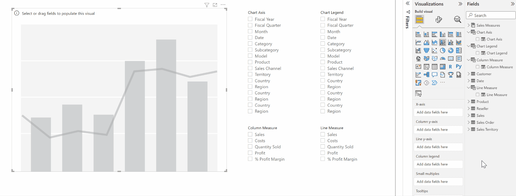
Building out the basics
To start building out our customisable chart, let’s first look at our model. We can use the AdventureWorks dataset, which is a basic star schema with measures like Sales, Cost of Goods Sold, Profits, etc. The measures are contained in a disconnected table called ‘Sales Measures’.

We can build out our chart by defining four separate Field Parameters:
‘Chart Axis’, which contains fields from the dimensions that the user might want to display along the x-axis of the chart.
‘Chart Legend’, a copy of ‘Chart Axis’ which lets users choose what is shown on the legend.
‘Column Measure’, which contains measures against the ‘Sales’ fact table to display as the columns of the chart.
‘Line Measure’, a copy of ‘Column Measure’ which lets users choose what measure is shown as an overlayed line chart.
Here are the DAX definitions for ‘Chart Axis’ and ‘Column Measure’. The other two parameters are defined similarly.


Then we can add a Line and stacked column chart visual on to the canvas. Note that it needs to be a combo chart if you want the flexibility to fully customise what kind of chart you end up with.

We can now drag each of our Field Parameter columns into the approporate field wells in the Visualizations pane…
In making the visual, you can see that…
When no selection is made on any of the Field Parameter slicers, it defaults to the first option for each. This doesn’t apply for the Line Measure though — when unselected, it shows all its measures at once.
The line chart starts out as disconnected dots rather than actual lines. This happens when the X-axis and Legend have the same field selected. Choosing different fields to appear on the axis and legend solves this.
The chart automatically sorts based on the sort order applied to the field. In the model, the ‘Date’[Financial Year] column is sorted on another column, so sort order is retained. For your own models, you may find strange sort behaviour if you haven’t explicitly defined the column sort orders. Wyn Hopkins has a video explaining this issue in more detail.
This very quickly gets us to the core functionality of the report. For example, we could build a chart showing Sales and Margin by Month, and broken down by Sales Territory…

But there are a few more functional items to fine tune to make the user experience better.
Showing and hiding chart elements
Showing all the chart elements at once can be overwhelming, so we’d like the option to omit some of them. This would allow us to show separate line charts and column charts rather than a combo chart of both.
To enable this, we can edit each of the four Field Parameter definitions in DAX to include a ‘blank’ option. We’ll need to add a custom row into each parameter, with the sort order given as -1 for each, so that option always appears at the top of the slicer.
The trick to getting this working smoothly is…
The ‘Chart Axis’ and ‘Chart Legend’ parameters need to reference a measure that just returns a blank. See the reference highlighted in red.
The ‘Column Measure’ and ‘Line Measure’ parameters need to reference a column where all the values are blank. This can just be a one-record table, and in this case the model already has a dummy column in ‘Sales Measures’ that can serve this purpose. See the reference highlighted in maroon.
If you apply columns and measures respectively (rather than measures and columns), then the outcome will still work. But you’ll get an explicit mention in the chart title of what’s missing, and it isn’t the cleanest way to present the visual…
So by setting the parameters according to the DAX above, we can generate visuals like these…


Adding hierarchies to the field selectors
For our Chart Axis and Chart Legend selectors, there is a long list of fields to choose from. Some of the fields even have the same names, e.g. Country may refer to the country of the Sales transaction, the Customer or the Reseller.
To make things clearer, we could rename the selected field names in the DAX definitions for the Field Parameters. But to make it even clearer to users, instead we’re going to create a hierarchy, with the name of the Dimension table acting as the parent item. To do this, we can add a calculated column to our Chart Axis and Chart Legend parameters.

The column definition above parses the Chart Axis Fields column to get the home table name. It then returns that for any row besides the first row, and in that case it just returns the child name “(No Axis)”.
We can do the same for Chart Legend. Then we can add the new Dimension columns into the Axis and Legend slicers to get our hierarchy.

The benefit of this hierarchy approach is that you can easily select multiple fields at one. This lets you drill up and down on the Axis, but the combo chart doesn’t let us drill up and down on a Legend.
If you want to limit the user’s ability to select multiple Legends at once, you can change the standard slicer to a Hierarchy Slicer custom visual. I’ve found that visual to be somewhat unstable though, where the slicer selections on one slicer can disappear when selecting another slicer. So sticking with the standard slicers would be preferable to this unstable behaviour.
Cleaning up the report page
With some rearranging of visuals, tweaks to the slicers and a few text boxes, we arrive at a nice clean view that evokes the Excel PivotChart interface…

Making a matrix the looks like a PivotTable
We can also build a PivotTable interface with a matrix visual, by using the baseline logic that we’ve already built up…

I’ve intentionally changed the default formatting of the matrix visual to make it look closer to the PivotTable that Excel users are used to.
For the report page above, I’ve repurposed the Chart Axis and Chart Legend parameters to select the matrix Rows and Columns. To ensure that the slicer options still make sense, I’ve adjusted the DAX in the Field Parameters so that the “(No Axis)” option now simply says “(No Selection)”, and similarly for the other slicers.
Since the matrix visual has only one field well that can accept measures, I’ve used just the Column Measures parameter in the matrix and removed the Line Measures slicer.
Try it out for yourself!
Download the Power BI report file I used in this post to play around and build your own understanding hands-on.