

10 ways you can use Calculation Groups in Power BI
When I first started learning about Calculation Groups, I could certainly see how much potential this new DAX feature would eventually have. Out of the gate however, there were a limited number of examples that they could be obviously applied to. Fortunately, the very engaged global Power BI Community has been actively using Calculation Groups, and discovered even more great uses for them!
My intention with this article is not to go through each technique in a huge amount of detail, but to give you an overview of each approach so you can link to other sources that cover the details. This post also focuses on applications of Calculations Groups, rather than how to set them up in the first place. If you’re not familiar with how to define calculation groups in Power BI using Tabular Editor, check out this video from Guy in a Cube to learn how.
Alright, now after those disclaimers, let’s dig into our list of 10 awesome applications of calculation groups, starting with the most obvious…
1. Time Intelligence
This is the standard application of calculation groups. If you have a Sales measure, you may want to implement time intelligence to see how your Sales stack up as far as week to date, year to date, month on month change, same period last year, etc. Defining each of these calculations for Sales is fine, but if you want to also perform these calculations against your Margins or your Cost of Goods Sold, you’ll end up with way more measures that become harder and harder to maintain.
The alternative is to create a calculation group and define these calculations once. Each of the time intelligence calculations can then be accomplished by filtering your visuals to use only one calculation item. You can also slice between them, or show them all together at once (see below). SQLBI have a great article that introduces you to calculation groups for time intelligence, check it out here.

2. Switch measures
A switch measure is a tried and true technique for changing what measure is represented in a visual using a slicer. This is typically achieved with a disconnected table and a measure that references other measures using the SWITCH function.
Be aware though that a limitation of a conventional switch measure is around how the measure is formatted. By default, a switch measure may refer to measures with different data types. Instead of dynamically updating the data type, a standard switch measure will inherit a Text type, which limits your ability to aggregate values and easily display them in the manner that you want (i.e. with $ and % signs where relevant).
Calculation groups offer a more robust alternate approach for switching between measures being displayed. Using the custom format strings that can be defined against each calculation item, you can set a measure to display as intended. Matt Allington has an article that takes you through this approach in detail. Here’s a preview of what Matt’s finished product ends up looking like…

The trick to implementing switch measures with calculation groups is to create an arbitrary dummy measure 1 to use in your visuals. You can then define each of your measures that you want to slice between as calculation items. Now when you use the calculation group as your slicer, the dummy measure will be replaced by your selected measure instead.
3. Dynamic format strings
The ability to define a custom format string for each calculation item is very powerful. Beyond using them to implement switch measures, you can also use them to change between different units of measurement.
For example, if you’re dealing with converting metric to imperial values, SQLBI have a tutorial on converting pounds and ounces to grams dynamically with format strings.
A more common use case in Business Intelligence is to convert between currencies. Bas Dohmen (at How to Power BI) has a cool video on how you can use format strings to display the correct currency symbol for the selected country in a matrix…
4. Extend category breakdowns with custom measures
You can extend the switch measure approach above to analyse a category breakdown and provide even more insights. For example, you may have a matrix that shows product spend broken down by year. Besides spend per year, you may also want to include some calculations in the same matrix that compare sales between years, as in the example below.
Matt Allington covers this application in his post Building a Matrix with Asymmetrical Columns and Rows in Power BI.

5. Displaying basic summary statistics
When you have a distribution of values in a matrix, you may want to know some summary statistics about the values - i.e. minimum, maximum, sum and average values. This can help to explore the data quickly, without having to drill down into the full details.
Kane Snyder has an interesting technique for exploring summary statistics for values in a matrix visual. For Margin values broken down by category in a matrix, he has a tooltip that displays what the minimum, maximum and average margin was over the last 6 months.

6. Changing which relationships are active
It can be quite common to have multiple different dates marked against a fact table record, e.g. Order Date and Delivery Date. If you want to relate your fact table to a date dimension, you can create a relationship for each of Order and Delivery Date, but you can only have one active at any given time. To use the date table against both dates, you could duplicate the date dimension and use it as a role playing dimension. But a more succinct alternative is to use the USERELATIONSHIP function to change the active relationship in a CALCULATE statement. Calculation groups can allow you to change the active relationship dynamically with a slicer. SQLBI have a video tutorial on this use case…
7. Activating bidirectional filters
Besides changing the active relationship, you can also change the filtering direction of a relationship. Including bidirectional relationships by default in your model can help with some calculations, but they can introduce ambiguity in your model, and increase your measure evaluation time as unnecessary filtering occurs.
Ideally you would want a way to only activate a bidirectional relationship when you need it. The CROSSFILTER function helps you do this, and by incorporating it into a calculation group, you can change the filtering direction dynamically with a slicer. Erik Svensen has an article that walks you through this topic - Using Calculation Groups in #PowerBI to implement a Many 2 Many (M2M) filter.
Beyond this many-to-many approach, you could also use CROSSFILTER as Erik has done to deactivate a relationship entirely.
8. Controlling bars, lines and labels in charts
You can also give users the ability to control what chart elements are displayed. Using an analogous approach to switch measures, you can use a slicer to change the measures that are shown in the columns and line values for a combination chart. But you can customise charts even more, like letting users control what chart labels appear, since showing them for both columns and lines can make your chart somewhat cluttered. Here’s what Kane Snyder has set up for a combo chart, which he has blogged about and described on a live stream with Reid Havens.

9. Highlight different subsets of data in charts
Another cool technique is to highlight values in a chart, like the minimum and maximum values. This can already be achieved with a switch measure, but calculation groups allow you to dynamically control the labels as well. The labels can be set to only show the highlighted values, and even add some commentary to them as well. Here’s the kind of charts you can build with the approach, which you can read about in Kane Snyder’s post on Dynamic Chart Labels with Calculation Groups.


Besides the labels above, you can set up your visuals to highlight values above the threshold, or your top N values. If you want to learn how to identify and highlight these values, check out my blog post on directing attention with conditional formatting.
10. Slice on multiple columns without unpivoting
In Power BI, you want to aim to have the right table structure from the start. If for whatever reason you can’t set up your tables as needed, you can use calculation groups to fill the gap instead.
For example, say you have a table containing costs over separate categories like this…
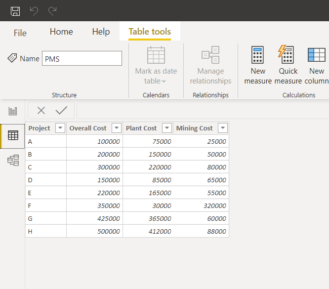
If you wanted to slice a chart showing costs to only show the Mining Costs, it wouldn't be straightforward to set up with this table structure.
Unpivoting is the obvious solution here, so you could also load an unpivoted version of the table 2 . Including two separate tables with the same data at different grains may make separate sets of calculations easier, but can have unintended side effects - If I were an end user, how would I know which table to build my visuals off of?
An alternate solution to this is to keep the one fact table, and use calculation groups to accomplish the same outcome as unpivoting would. You can define separate calculation items that aggregate over each cost category, and use the calculation group as a slicer to control which costs are shown. Mudassir Ali at Enterprise DNA walks though this approach below…
Summary
These are just some of the uses for calculation groups that have been uncovered so far. Have there been any other useful applications I’ve missed? Let me know in the comments below, and in future we may be able to assemble a follow up list with even more ways to implement this great feature!
Full list of references
Guy in a Cube - REDUCE the # of measures with Calculation Groups In Power BI
SQLBI - Introducing Calculation Groups
Matt Allington @ Excelerator BI - Dynamic Formatting of Switch Measures
Matt Allington @ Excelerator BI - Building a Matrix with Asymmetrical Columns and Rows in Power BI
Bas Dohmen @ How to Power BI - Dynamic NUMBER FORMATTING using CALCULATION GROUPS in Power BI
Kane Snyder @ Ten Fingers - Combining calculation groups in Power BI to create powerful reports
Kane Snyder @ Ten Fingers - Allowing users to choose any two different metrics to compare in a single chart with calculation groups.
Kane Snyder @ Ten Fingers - Dynamic Chart Labels with Calculation Groups
Havens Consulting - Calculation Groups (with Kane Snyder)
Erik Svensen - Using Calculation Groups in #PowerBI to implement a Many 2 Many (M2M) filter
Mudassir Ali @ Enterprise DNA - Avoid Unpivoting Columns With Calculation Groups - DAX Tutorial
-
In Matt's post, he defines his dummy measure as SELECTEDMEASURE(). However, as Kane Snyder kindly pointed out to me, it doesn't matter what you define as your dummy measure since the applied calculation item will overwrite it. ↩
-
In this scenario, I’d have structured the main table as unpivoted in the first place. Excluding the overall cost column is also ideal, since this can be calculated with a measure. It’s still worthwhile being across these techniques though, as you may find yourself in a scenario where it is difficult to shift away from an established data model structure. ↩